Kristen Gilles

Marketing technologist

profile picture

Hi, my name is Kristen:

I'm a marketing technologist who thinks in systems, not just how a campaign gets executed, but why a data model breaks, where a customer journey falls apart, and what the technology needs to do to support a business goal. By nature I'm curious and inquisitive; I want to understand the who, what, where, when, why, and how behind every problem before I try to solve it. That curiosity has taken me across a lot of different environments from Fortune 100 enterprise, Salesforce implementation consulting, independent client work and in each one I've had to adapt quickly, learn the landscape, and find solutions without a defined roadmap. My hands-on depth in email and campaign infrastructure comes from that same instinct: going beyond what the role required to actually understand how things work. But execution has always been where I start, not where I stop. I'm most energized when I'm working upstream, shaping the strategy and architecture behind a campaign rather than just delivering it. On this site you'll find examples of that technical craft - more to come.
Work

Post-Cruise Nudge:
Behavioral Timing & Emotional Design

View Email Here
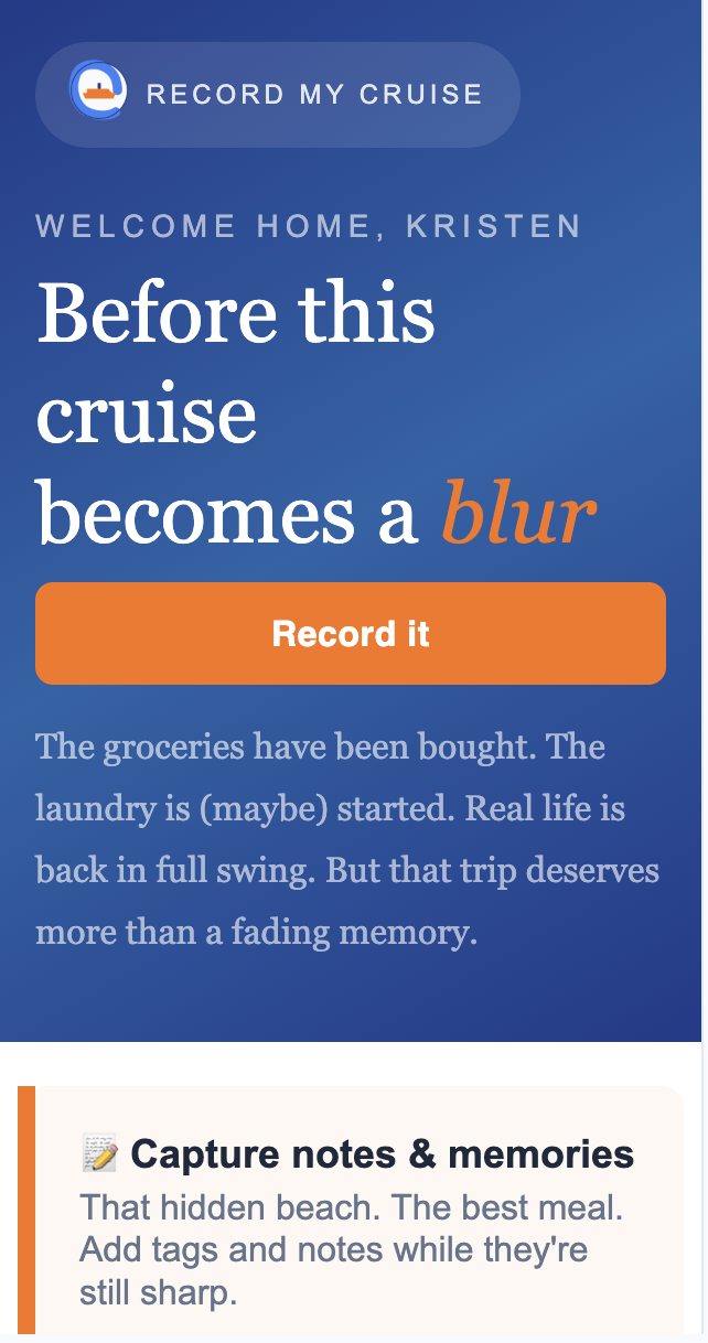
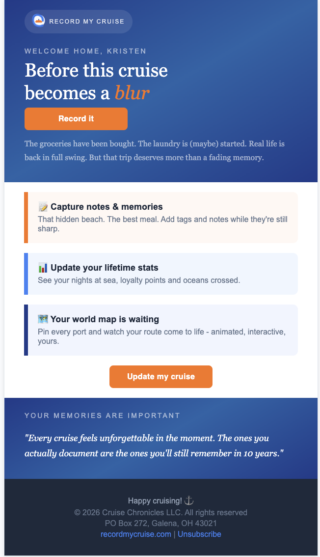
This email was designed around a simple behavioral insight: memories fade fast, but motivation to record them follows a predictable emotional arc. Rather than sending a single generic "share your trip" prompt, this was designed as a two-part touchpoint strategy tied to where a guest was in their emotional journey, a mid-cruise email, sent while they still had time and energy to reflect in the moment, and this post-cruise nudge, timed a few days after return once the logistics of coming home had settled but nostalgia was still fresh. The subject line ("Before this cruise becomes a blur") leans into loss-aversion and nostalgia rather than neutral, informational phrasing, betting that reminding someone what they stand to lose (the memory) motivates action more than a plain reminder to log in.
Across 25 sends, this email saw a 72% open rate and a 28% click rate - notably outperforming the Mid-Cruise email's 47% open rate and 12% click rate (n=43), which used more neutral, informational phrasing ("Update your cruise log"). That gap is a real signal that the loss-aversion/nostalgia framing is doing real work here, not just filling space - though with sample sizes this size, it's a promising early result worth continuing to test as volume grows, not a settled conclusion.
See the Mid-Cruise companion piece for the full comparison.

Feature eNewsletter:
Re-Engagement Through Value Discovery

View Email Here
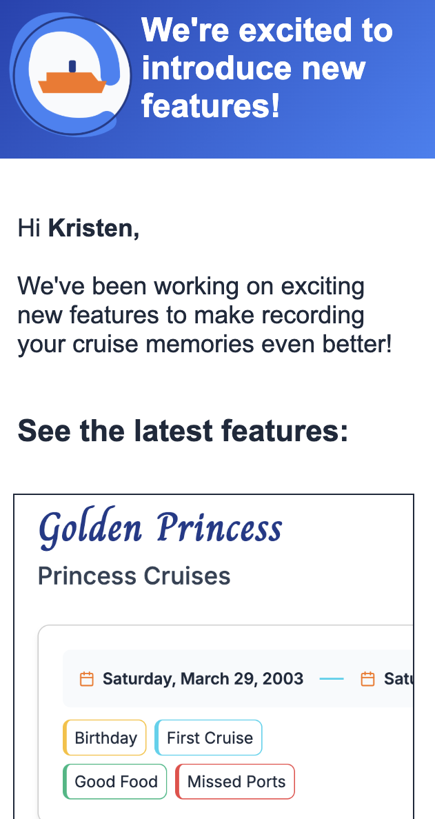
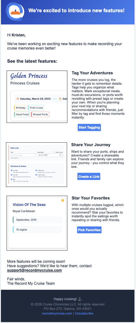
This email served a dual purpose in the customer lifecycle: reactivating dormant accounts and driving feature adoption. Rather than a simple "here's what's new" announcement, the strategic goal was reminding users of an account relationship they may have forgotten about, then giving them a concrete reason to re-enter the product, new functionality they hadn't yet experienced. The underlying bet was that feature announcements are more effective as a re-engagement lever than as a pure product-update broadcast: users who left an account dormant need a reason to come back, and "something new exists that you haven't tried" is a lower-friction hook than a generic win-back message. This ties feature communication directly to activation and retention strategy, not just product marketing.
Across 293 sends (July 7–10, 2026), this email saw a 39% open rate and an 8% click rate. That's a meaningfully larger sample than the cruise touchpoint pair, which makes it a useful baseline for comparison but, on its own it points to an opportunity rather than a win: with roughly 6 in 10 recipients never opening, the subject line's anticipation angle isn't yet doing enough to break through. Another factor could be that the timing of the email not being tied to an activity has weaker performance.

The Fresh Basket:
Personalized Re-Order Campaign (Concept Piece)

View Email Here
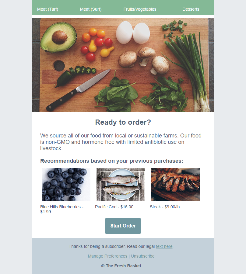
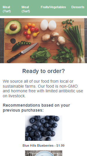
I built this concept email to demonstrate the full arc from marketing rationale to execution not just design, but the thinking behind each decision. The strategic premise: recurring-order businesses succeed by reducing the friction and mental effort of reordering, not by re-selling the value proposition every time. The headline leads with a direct, low-effort question a nudge rather than a pitch because a returning customer doesn't need to be convinced. The body copy stays brief and reinforcing rather than persuasive, since the goal is recall, not conversion from scratch. The centerpiece is a three-column recommendation module built around purchase history, using mobile stacking (responsive columns that collapse to a single full-width column on smaller screens) so the recommendations stay scannable on any device — treating personalization as a conversion lever rather than a decorative feature, since showing customers exactly what they'd likely want reduces the number of decisions between "I got this email" and "I placed an order." I coded the email myself to a production-ready standard, so the piece demonstrates both the marketing logic and the technical fluency to execute it without a handoff.

Wine&Paint Not🖌 Night (Concept Piece)

View Email Here
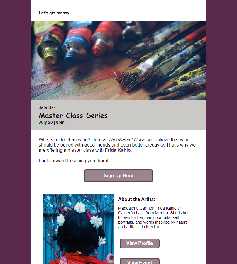
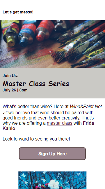
This concept email was built to demonstrate persuasive design layered on top of technical execution by using an emotional hook and a structured layout to guide returning customers toward a higher-value event. The strategic premise leans on pathos: for a paint-night studio, the product isn't really the painting, it's the shared experience of good company, creativity, and low stakes.
This piece takes that same emotional territory and raises the stakes slightly by introducing a coveted expert instructor, reframing a familiar recurring activity ("another paint night") into something more exclusive ("a master class with someone sought-after").
The structure mirrors how that decision actually gets made: lead with the core ask (a prominent sign-up button after covering who/what/where/when, since returning customers don't need to be sold on the studio itself), then follow with credibility-building content an artist portrait and bio for anyone who needs a bit more conviction before committing. Giving that second section its own two CTAs (learn more about the artist, or go straight to the event page) accounts for two different reader mindsets without forcing everyone through the same path.
Technically, the piece uses mobile stacking on its two-column module with two independently-functioning buttons - responsive columns that collapse to full-width on smaller screens - built to hold up across email clients and demonstrating the coding sophistication behind what reads as a simple layout.

Horticultural Home 🌿
Seasonal Newsletter/Promotion Hybrid (Concept Piece)

View Email Here

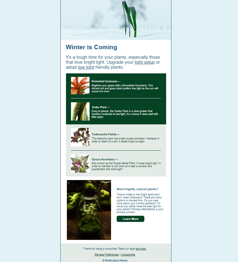
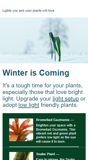
This concept email blends editorial content with a seasonal sales push, using a pop-culture hook ("Winter Is Coming") to land at the exact moment the audience's problem becomes urgent the seasonal drop in light that stresses light-sensitive houseplants.
Rather than opening with a product pitch, it leads with an educational hook: a chart showing which plant species tolerate low light and which will suffer without supplemental light. This positions the brand as a knowledgeable resource before it positions itself as a seller, which builds trust with a plant-owner audience such as myself.
The species chart also lets the email serve two audiences at once, people whose plants can survive as-is (pointed toward "adopt low-light friendly plants") and people whose plants need help (pointed toward "upgrade your light setup") - segmenting intent within a single send rather than sending two campaigns.
The closing module reframes the purchase decision around the reader's actual motivation (aesthetics, plant health, or budget), acknowledging that "buy a grow light" isn't a single use case.
From a production standpoint, the piece showcases some of my plants and a data-driven comparison chart. I wanted to lean into my creativity and technical ability to code a structured data display in email which is a non standard layout for most marketers.

Take-a-Hike!:
Serialized Destination Newsletter (Concept Piece)

View Email Here
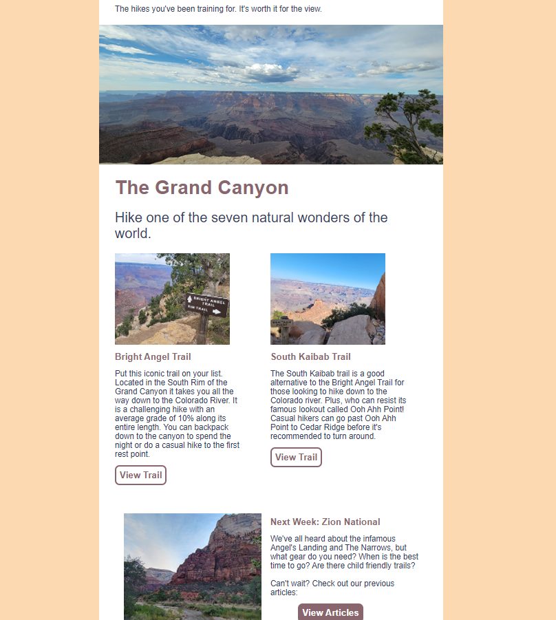
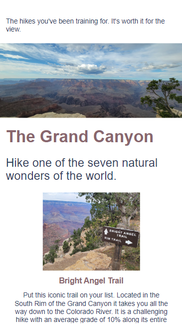
This concept newsletter is built around a serialized content strategy - treating each national park as one installment in an ongoing subscriber relationship, rather than a one-off send. The Grand Canyon edition is structured to serve two reader states at once: hikers ready to commit to a specific trail right now, and hikers who just want to stay engaged with the community and content.
Each trail module (Bright Angel, South Kaibab) pairs a strong visual with practical trip-planning detail (difficulty, mileage context, what makes it worth doing) then routes directly to the authoritative source (NPS trail guides) rather than a generic "learn more," which builds trust by not gatekeeping information the reader actually needs.
The closing module does the retention work: teasing next week's Zion installment with a hook (what gear, when to go, kid-friendly options) that pre-sells the next email before this one is even closed, while also giving readers a path to back-catalog content if they want more now.
Technically, the piece uses mobile stacking — responsive two-column modules that collapse to a single full-width column on smaller screens — a layout decision that matters here specifically because trip-planning content is often read on a phone, mid-trail-research, not at a desk. The photography is 100% original, reinforcing brand authenticity for a niche, enthusiast audience that would clock stock imagery immediately.

Portfolio Email

Portfolio Email

View Email Here
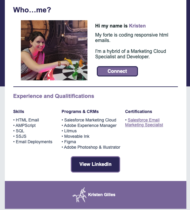
Honestly, this one was a fun side quest. Just me following my curiosity and playing around. I figured - I make emails for a living, and I have a portfolio site, so why not make the portfolio itself an email? The photo is me playing holochess on a recreation of the Millennium Falcon - another slice of what I'm into outside of work, same as the paint nights, houseplants, hiking, and healthy food running through the rest of this portfolio.
On the technical side, I used this one to break out of the box - literally. Most emails live inside a safe little 600–640px container, but I built a full-bleed dark purple background section that stretches edge to edge, which takes extra coding know-how to get rendering consistently across email clients.

Mid-Cruise Nudge: In-the-Moment Data Capture

View Email Here
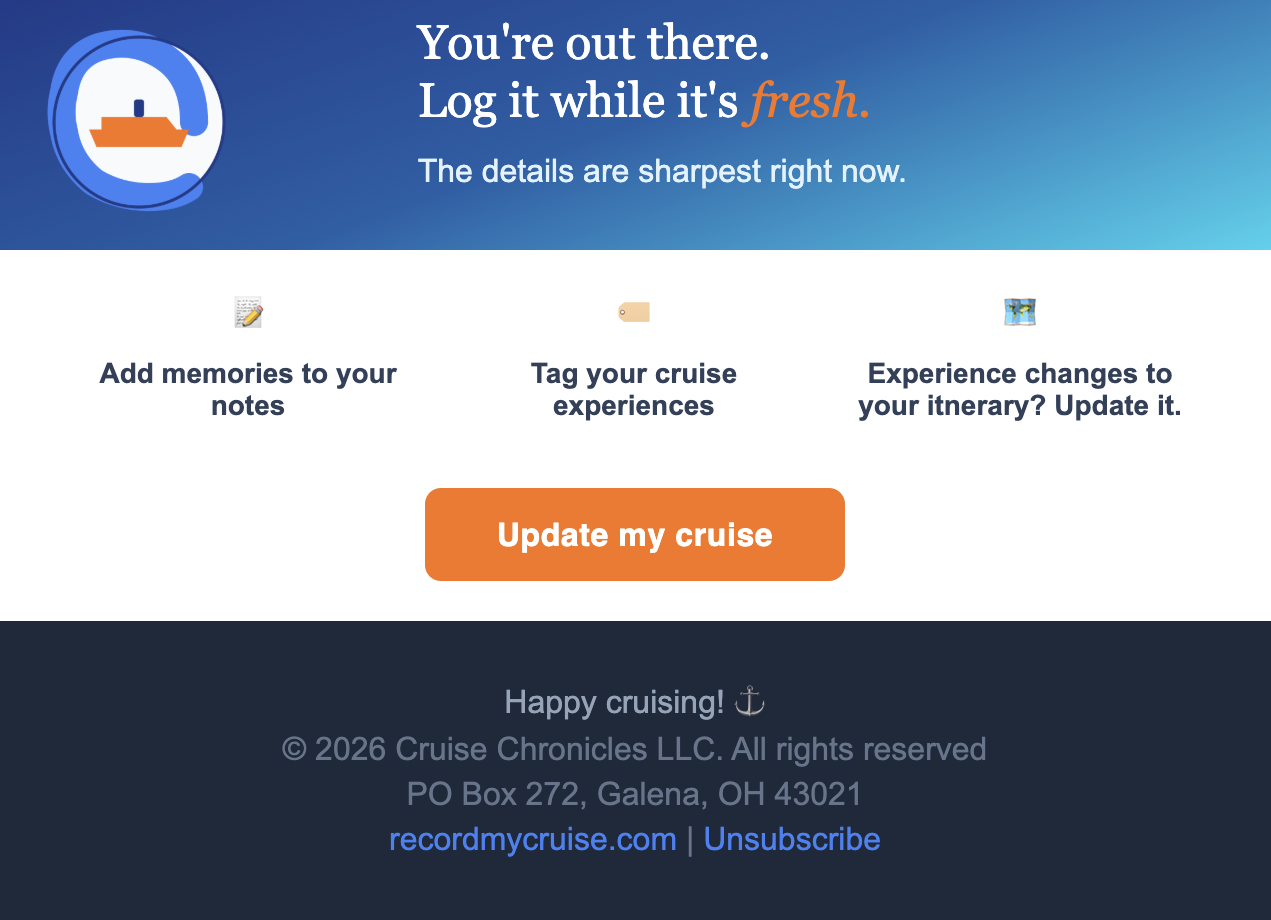
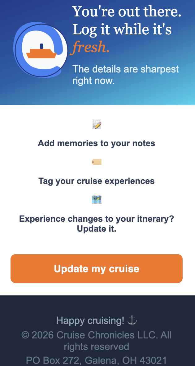
This is the first half of the two-part cruise touchpoint strategy — the companion to the Post-Cruise Nudge, sent while the guest is still actively on their trip. The strategic aim here is different from its post-cruise counterpart: this one isn't about emotional re-engagement, it's about data capture at the moment details are most accurate. The copy leans on immediacy ("log it while it's fresh," "the details are sharpest right now") because memory decay makes good data a challenge — the longer you wait, the vaguer and less useful the input gets. The tagging prompt in particular is designed with a second-order use case in mind: those tags become structured data that could eventually power cruise recommendations for other users based on real traveler-generated input.
Across 43 sends, this email saw a 47% open rate and a 12% click rate — notably lower than the Post-Cruise email's 72% open rate and 28% click rate (n=25). That gap points to something worth acting on: the neutral, informational framing here ("Update your cruise log") appears to underperform the loss-aversion/nostalgia framing used in Post-Cruise ("Before this cruise becomes a blur"), a signal worth testing further as send volume grows.

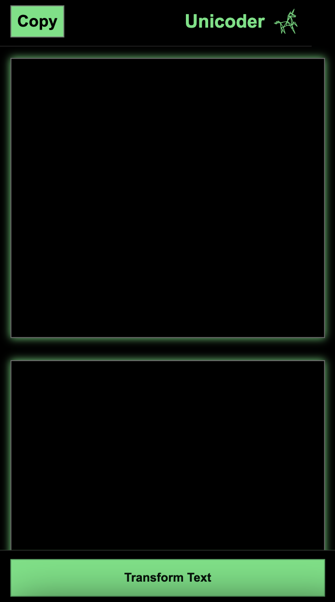
Unicoder

View Site Here

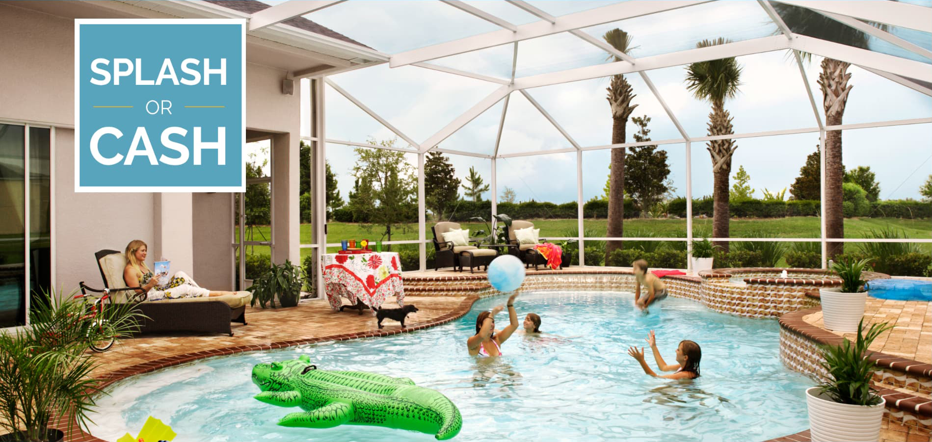
Splash Cash: Marketing promotion

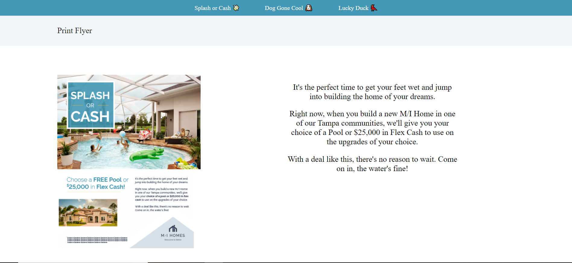
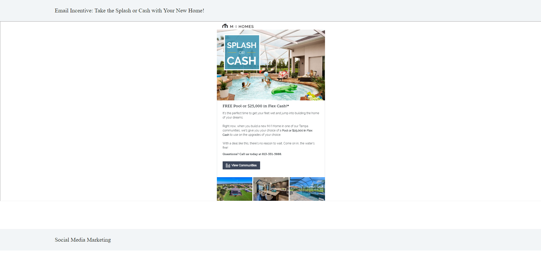
My team created the winning marketing campaign. The concept of the campaign was called "Splash or Cash." I built a responsive website to display our various campaign ideas.

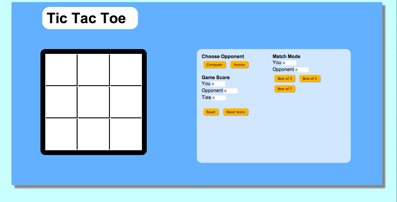
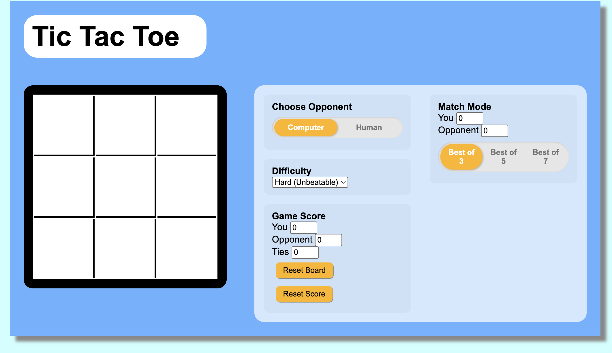
Tic Tac Toe

View Site Here

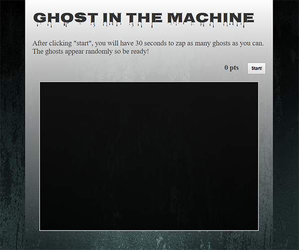
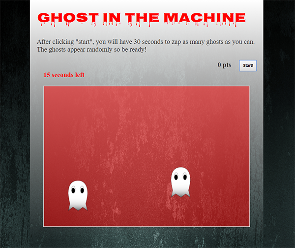
Ghost in the Machine

View Site Here

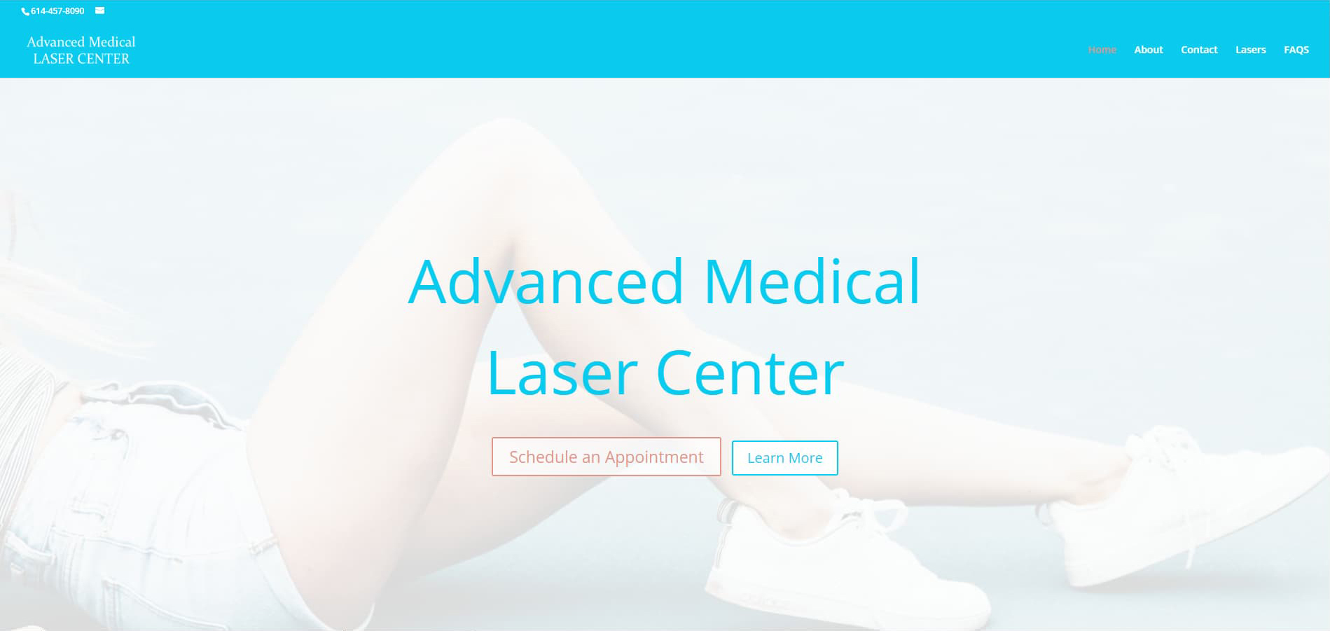
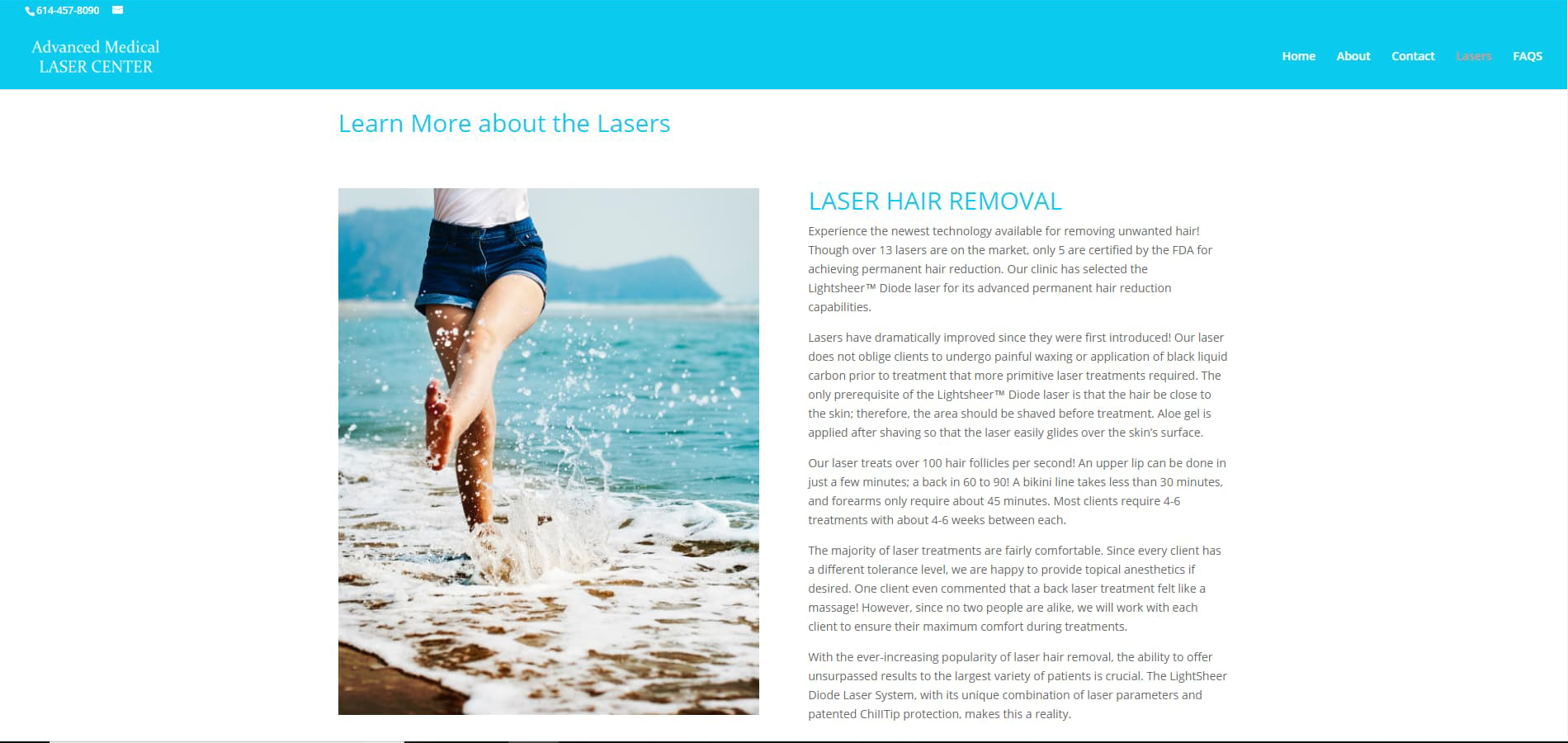
Advanced Medical Laser Center:
End-to-End Client Website Build

View Site Here
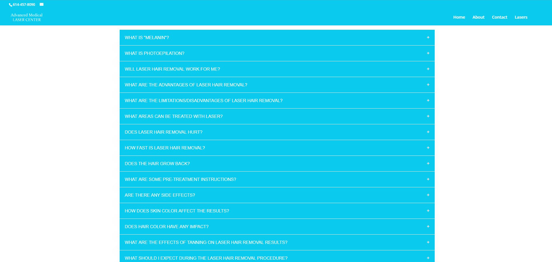
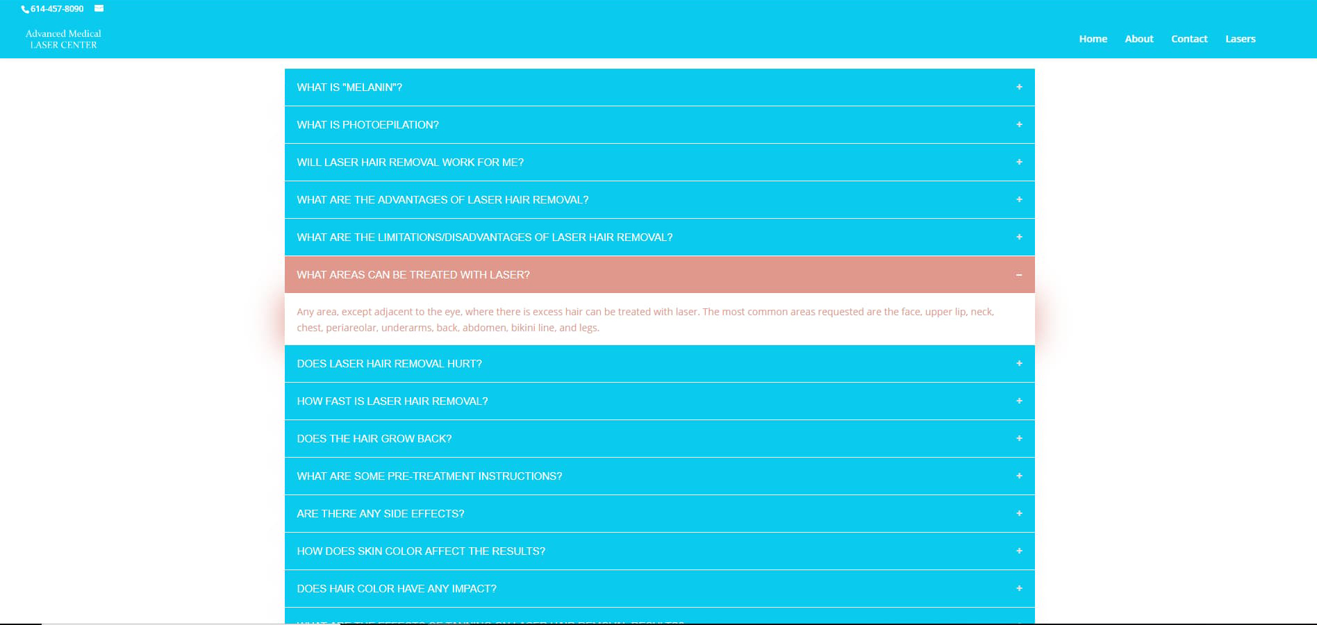
This was a full client engagement from the ground up not just a build, but the discovery and design thinking that came before any code was written. Working directly with the client, I made the brand-level decisions (color palette, page layout, content and messaging) needed to represent a small, locally-owned medical aesthetics business online, then backed that up with original photography of the client's own equipment rather than generic stock imagery, which matters for a local service business where trust and specificity sell better than polish alone. On the technical side, I hand-coded a custom accordion component for the FAQ section a deliberate UX choice to keep a content-heavy page (treatment info, policies, pricing questions) scannable rather than overwhelming a visitor on a small business site where most traffic is likely on mobile.
I also configured a domain-based business email for the client as part of the engagement, and iterated on the site over multiple rounds of client feedback, managing the relationship and the revisions independently, without a project manager or account lead in between.

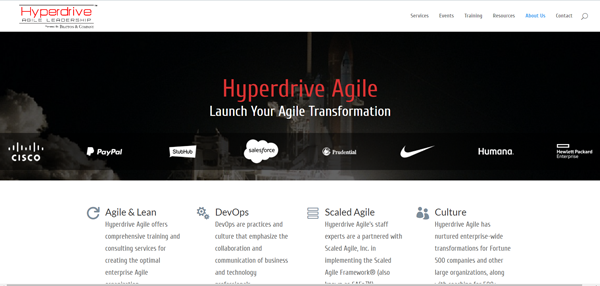
Hyperdrive Agile:
Ongoing Site Maintenance &Client Management

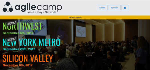
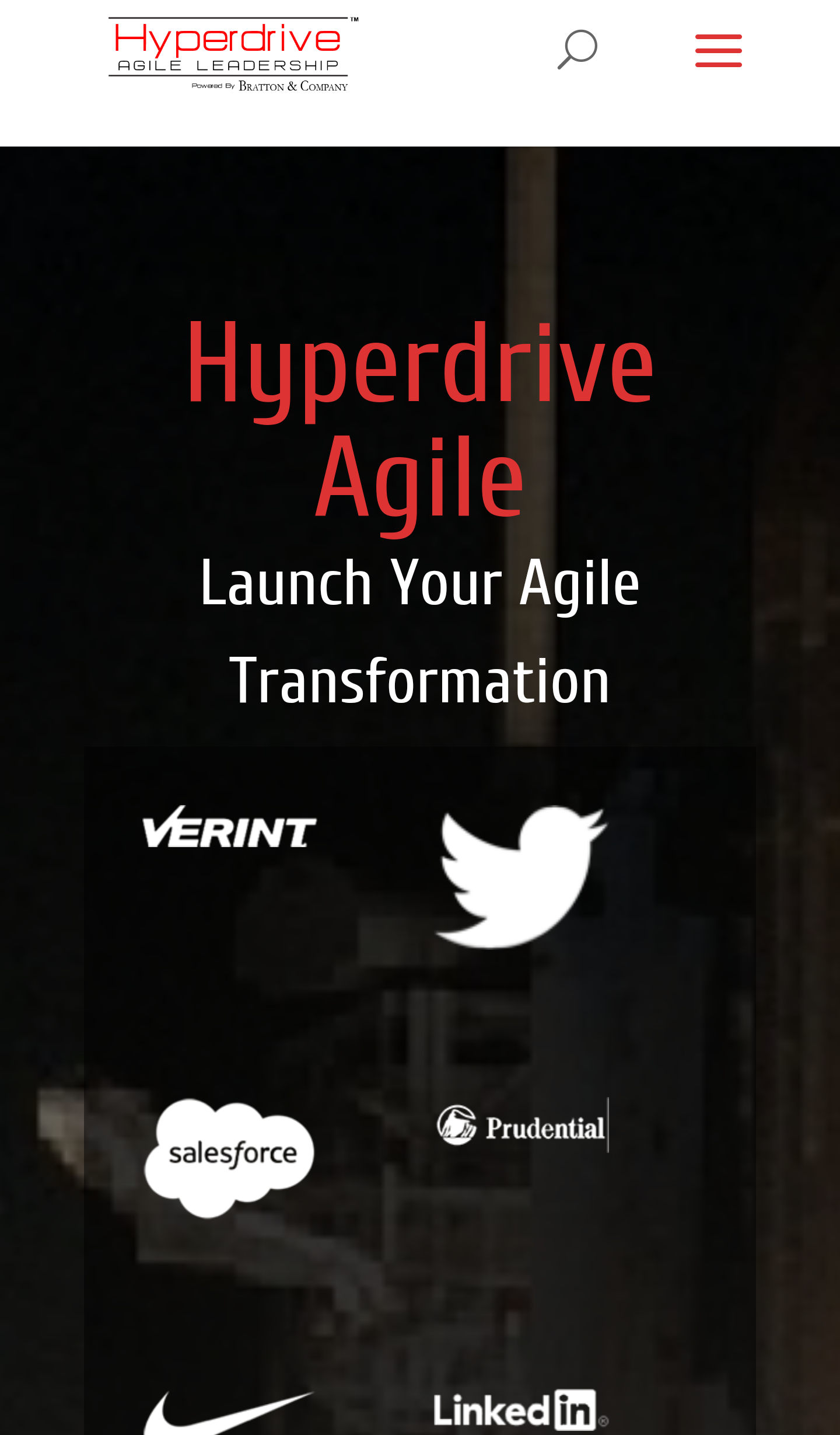
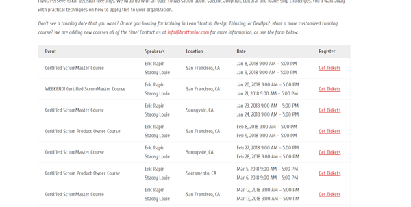
This was an ongoing engagement rather than a one-time build. I maintained an event site for a client hosting Agile-focused conferences. The work centered on keeping the site current as each event cycle changed: updating speaker images and event dates, and designing a logo banner to refresh the site's visual identity. I took content and design feedback directly from the client and translated it into updates myself, serving as the sole point of contact for a period of time — meaning the client had one person to bring feedback to rather than routing through a larger team.
This kind of engagement demonstrates reliability and responsiveness over time, working within an existing site rather than starting from scratch.

AgileCamp: Ongoing Site Maintenance &smp; Client Management

A parallel engagement to Hyperdrive Agile, maintaining a second event site for the same client's Agile-focused event portfolio. Work included updating speaker images and event dates as AgileCamp's own event cycle changed, along with logo banner design to keep its visual identity current and distinct from the client's other site. As with Hyperdrive Agile, I worked directly from client content and design feedback and served as the sole point of contact managing the relationship for a period of time - running two related but separately-branded sites for the same client simultaneously.

Thanks for stopping by!

Still want to learn more?

iconEmail me Connect on LinkedIn